A mobile application that uses gamification, behavioral nudges, and financial incentives to influences sustainable purchasing behaviors on electronic devices.
My Role: Lead UX Designer, Project Manager
Responsibilities: Interaction Design, Usability Testing, Wireframes, Information Architecture, Ideation, User Research, UX/UI Design
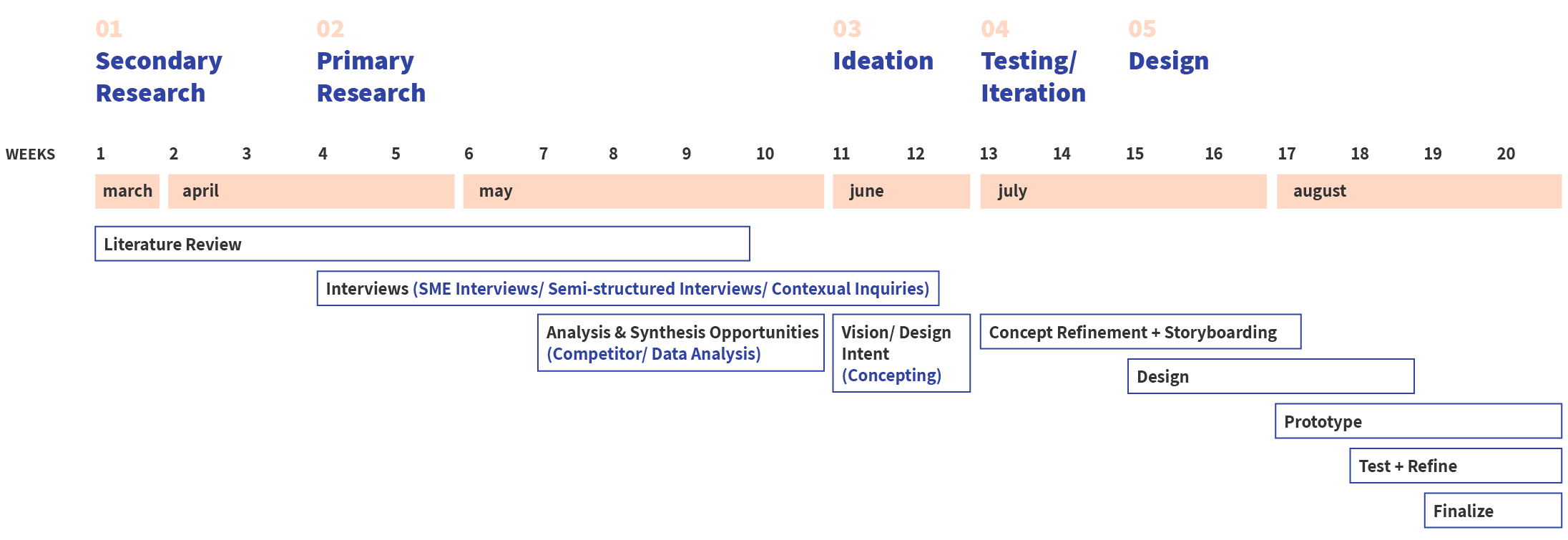
Timeline: 6 month
Software: Miro, Figma, Adobe Illustrator, Premiere Pro, After Effects

Advised by: Kim Pimmel | Adobe
The increase consumption of electronics in modern world causes negative effects on air, soil, water and humans health even after being recycled.
This project is a capstone project of the University of Washington's MHCI+D program.
We noticed the dramatically accelerating pace in the development of new technologies and found out there’s a huge negative impact on sustainable development, which is e-waste.

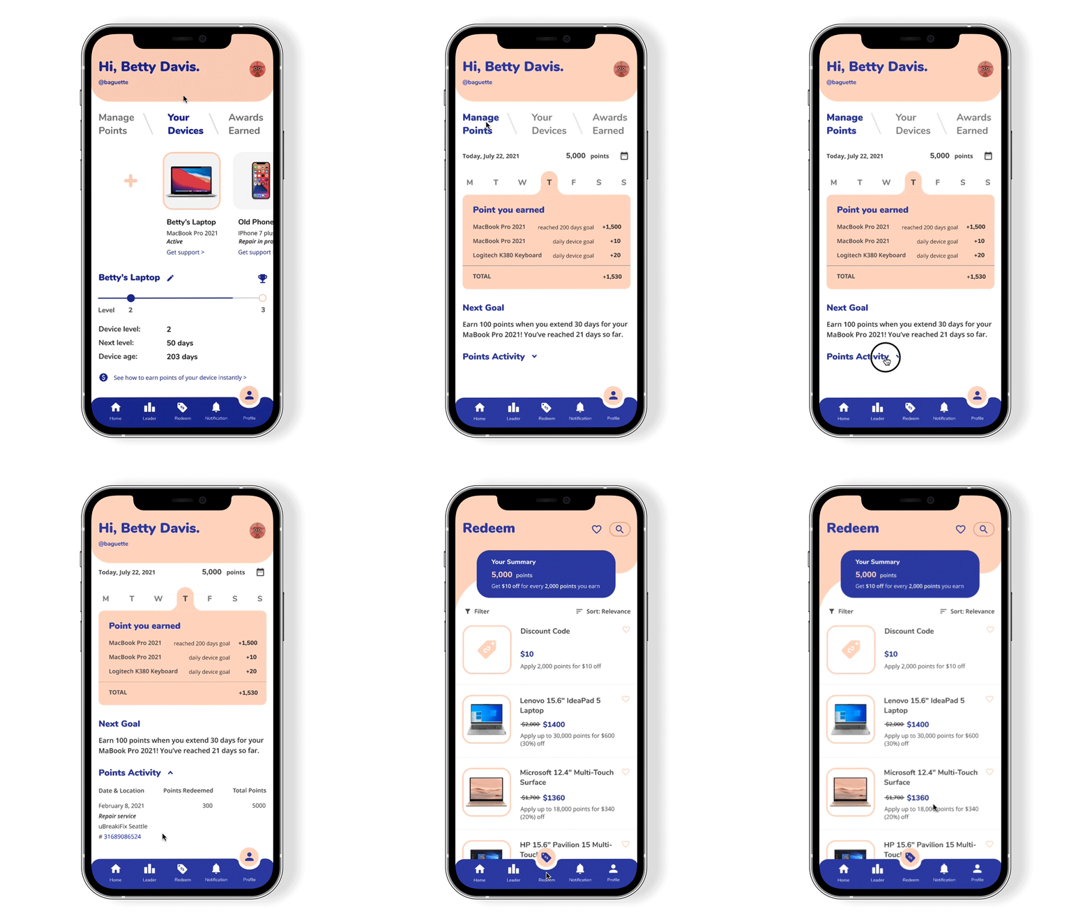
Ellipse rewards users with points for extending the life of their electronics daily. The longer users use their electronics, the more points they earn. Users can also earn points by taking actions that relate to e-waste, such as reading articles on the news feed, and repairing and recycling their electronics.
In addition, the points can be redeemed on Ellipse for both new and refurbished products.
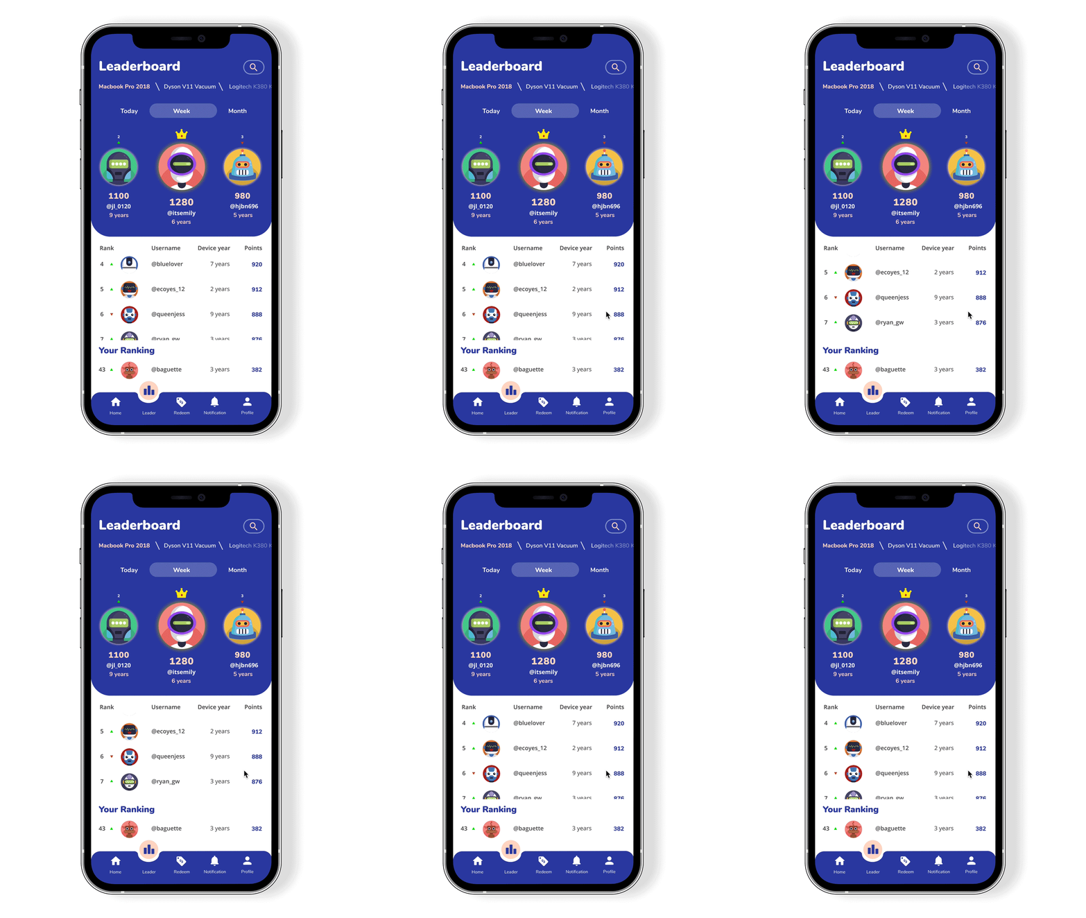
Ellipse gamifies the usage of electronics through a leaderboard that shows how long other users are using the same devices, to encourage users to extend the life of their devices.
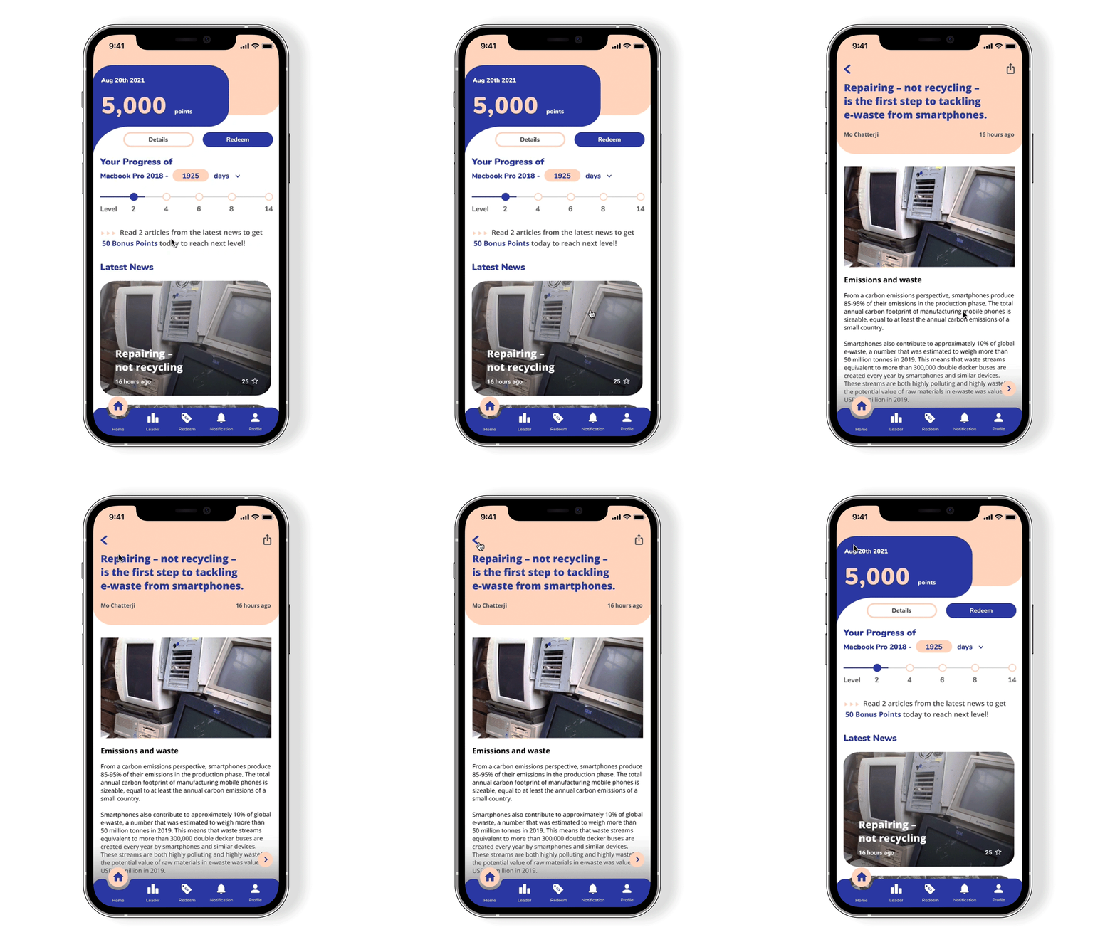
The first step toward change is awareness. Ellipse offers e-waste news articles on the home page for users to learn more about the e-waste issue and how to help.


Developments in electronics have led to increased usage of electronic products across the world and it increases in electronic waste or e-waste. Furthermore, formal recycling of e-waste is an expensive and slow process. With the recent limitations to export e-waste, recycling efforts are being outpaced by the mass consumption and planned obsolescence of the manufacturer.
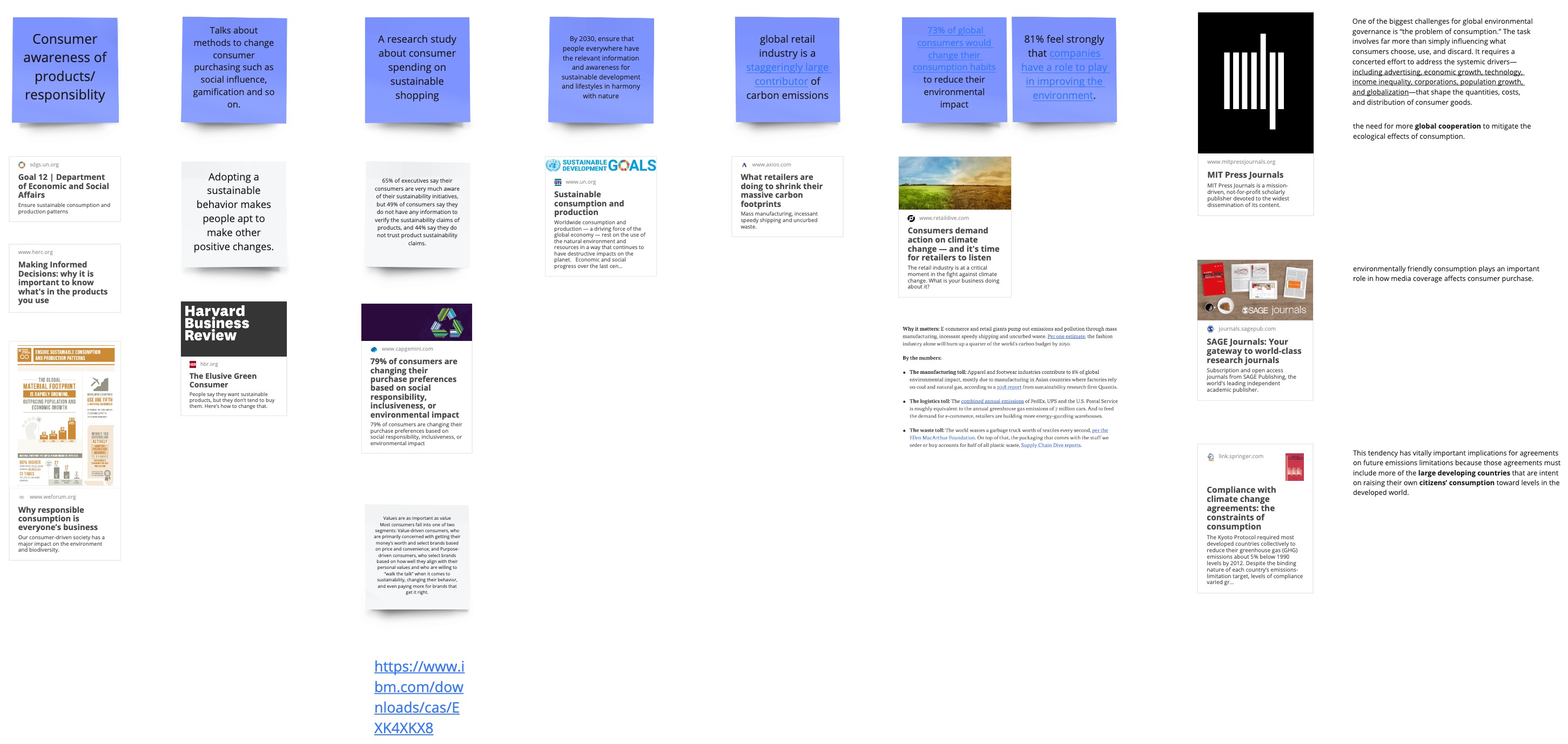

Our goal was to understand Millennials’ shopping behaviors and decision factors when purchasing electronics, in order to understand why Millennials neglect to consider the environmental impact of purchasing small electronic devices.
We spoke first with three subject matter experts (SMEs) and then conducted 12 interviews with potential users in our target group (millennials in the US with moderate to high incomes).


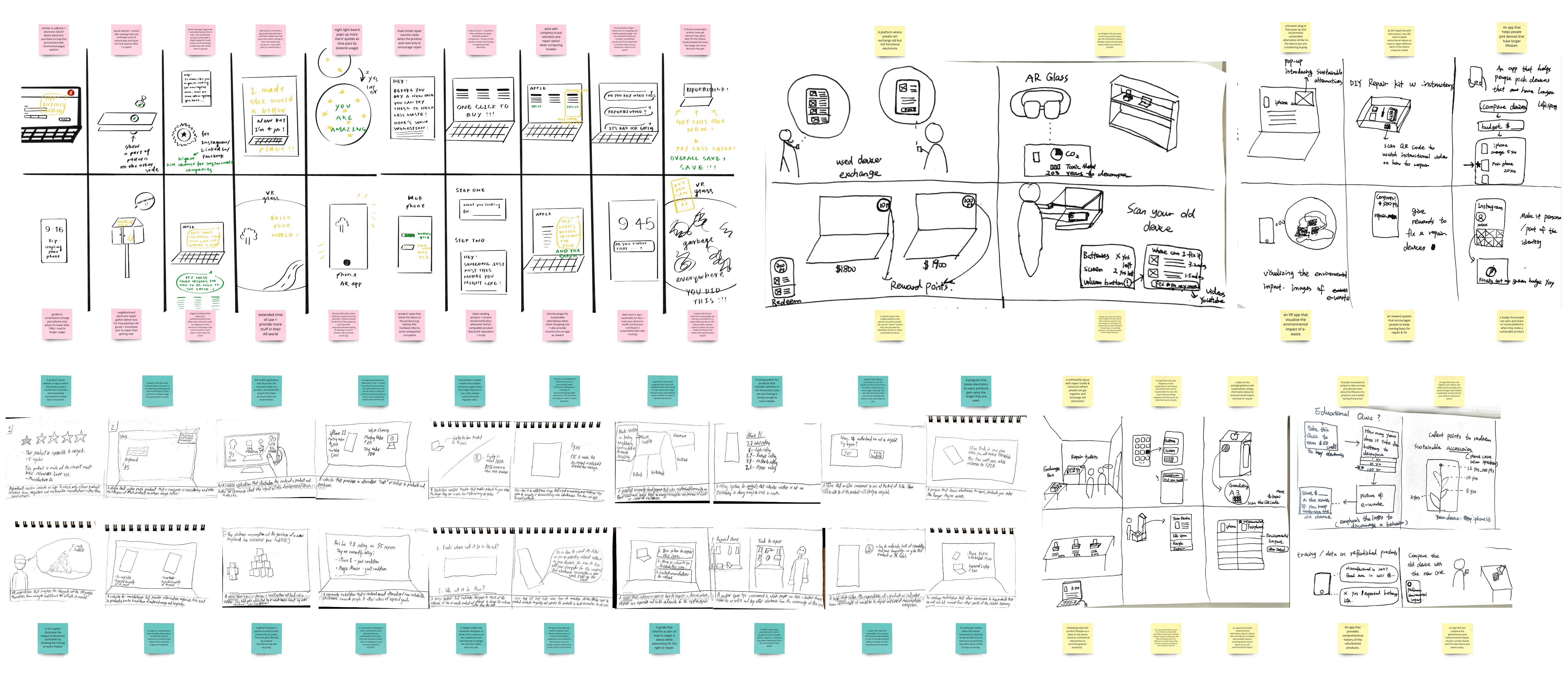
As a team, we generated 60 design concepts to target the problems that we found.

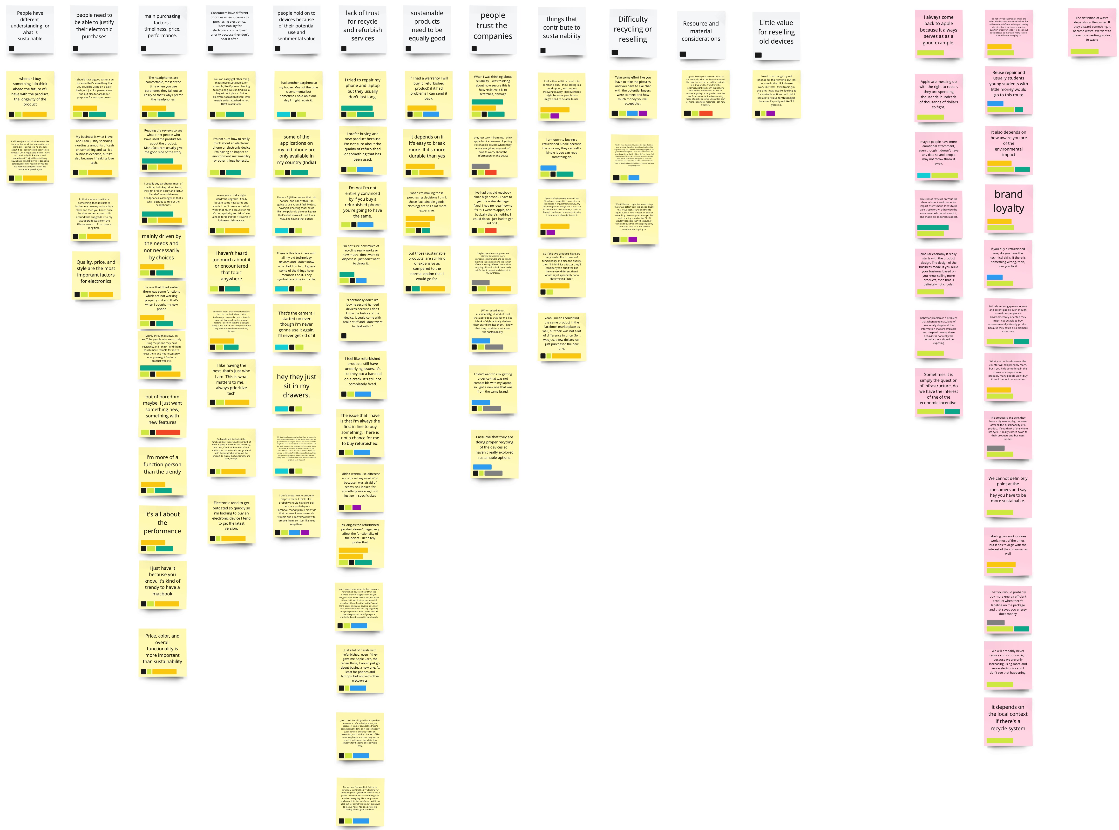
We applied several ways of affinity mapping to synthesize our data to lead the downselection process. Finally, there were three concepts that aligned the most with our design principles, motivational, informative, and convenient. Using those principles, we were able to narrow to three concepts that best-aligned with our goals:

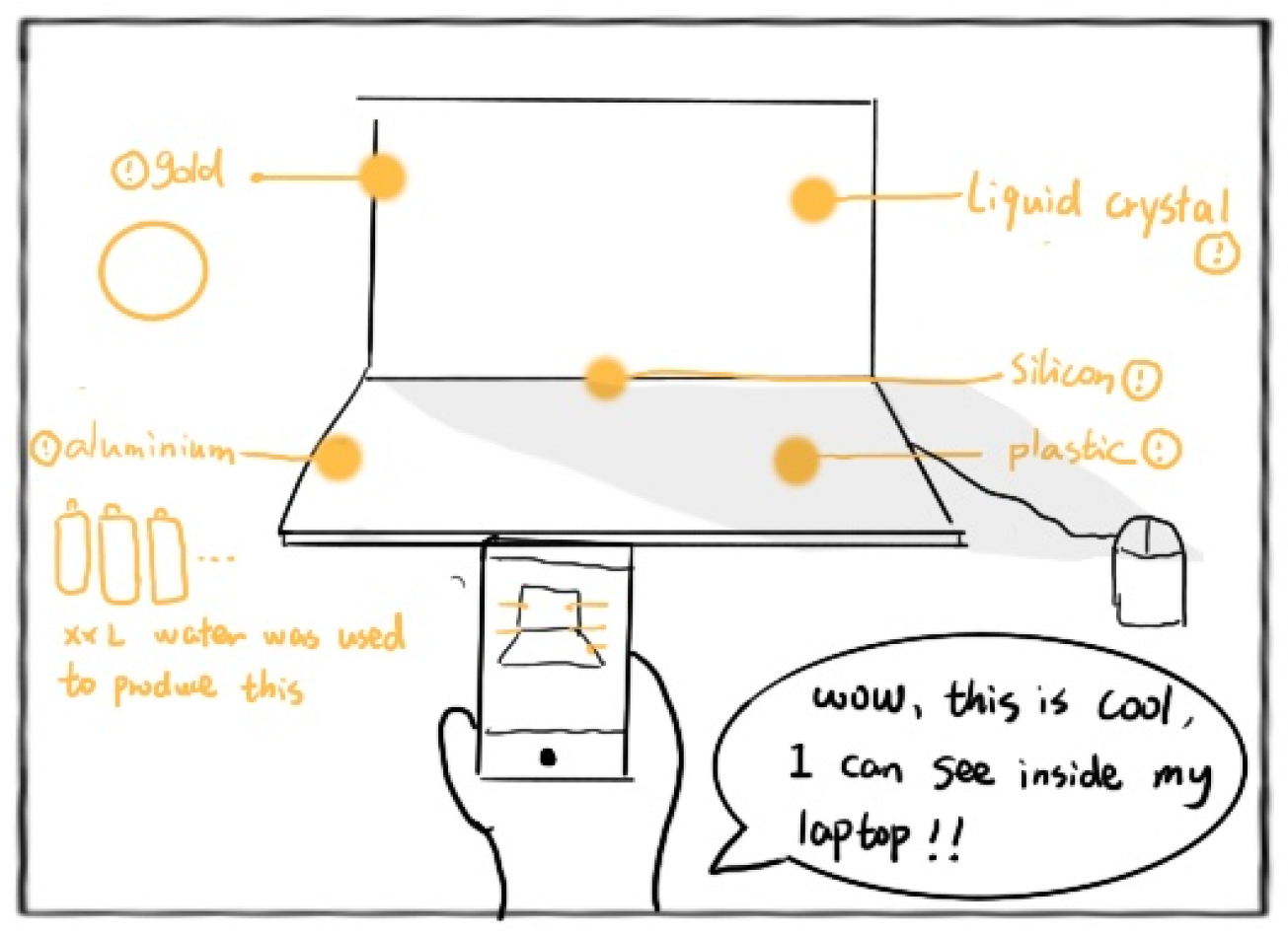
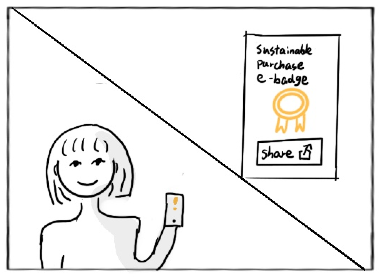
Our initial concept was a mobile AR application that uses one of the behavioral change methods, "Incentivize behavior by allowing a user to achieve status and prestige through achievement badges to share on social media”, as an incentive for users to extend the life of their devices. In addition, this solution might provide something fun with the AR camera to keep users on the app.
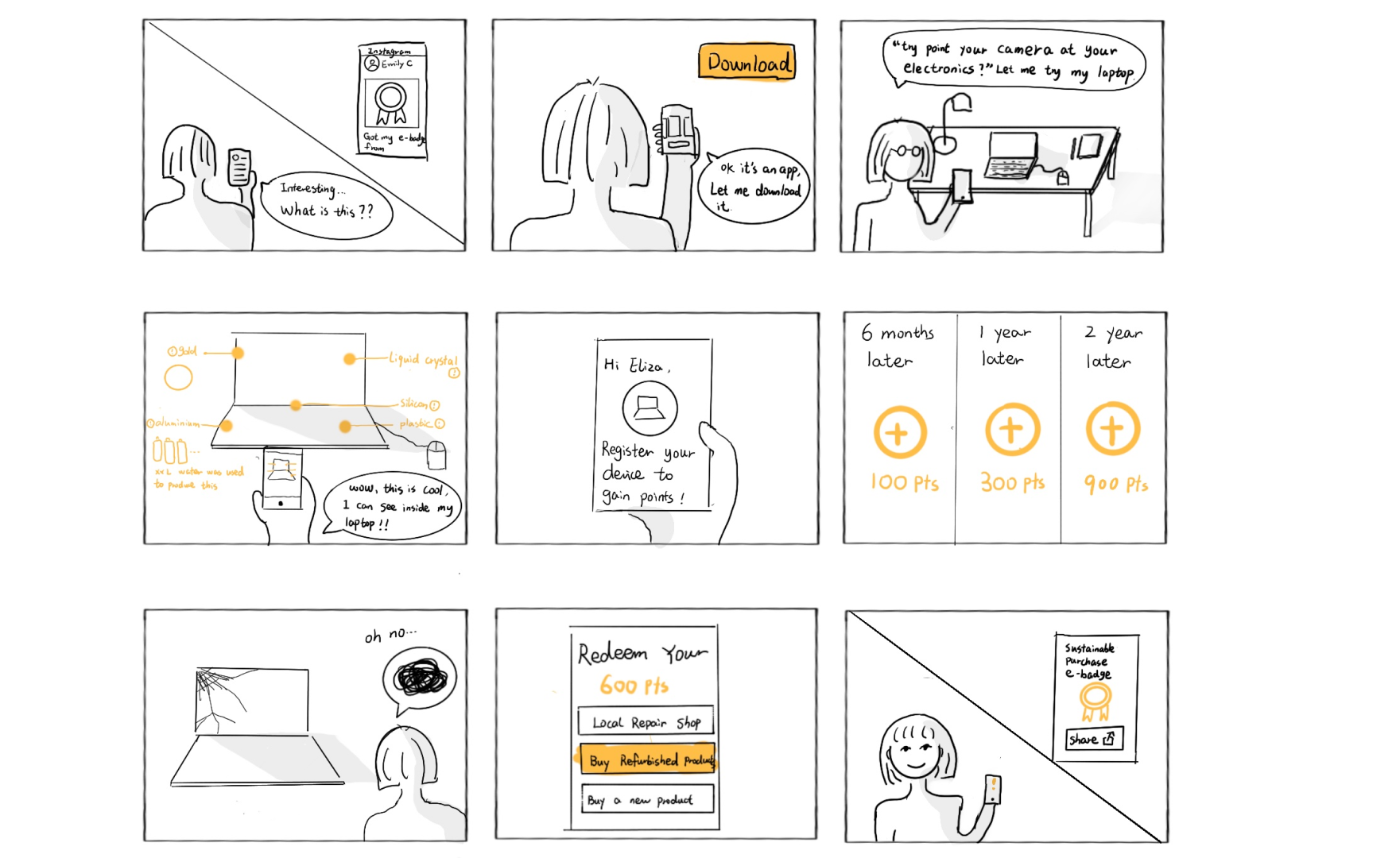
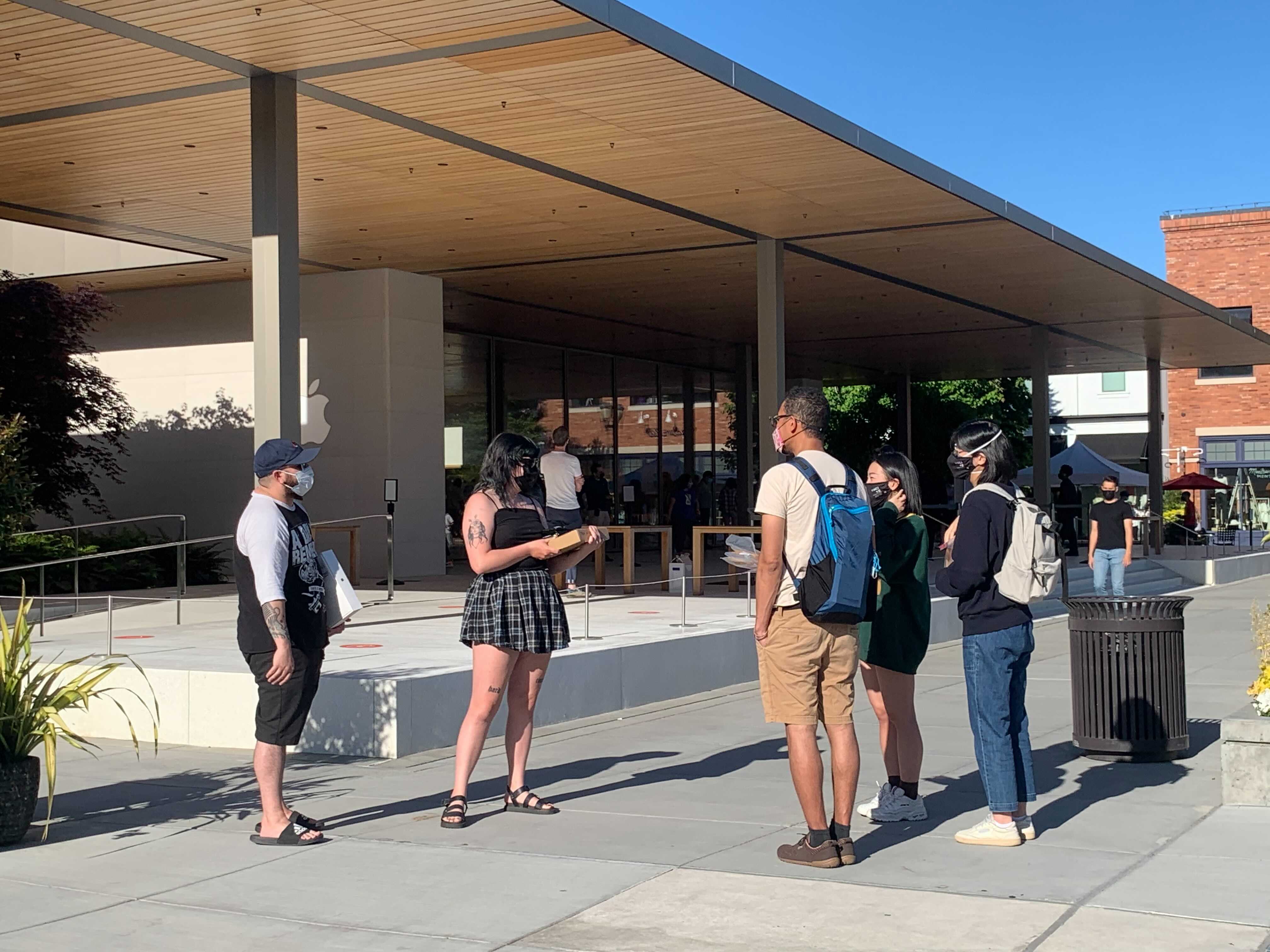
We recruited and conducted testing with millennials of medium to high income in Seattle with various backgrounds to test the viability of the product. I led the team to derive the testings into actionable insights to guide ongoing design direction.
"If the goal of the project is to influence as many people as possible, AR will limit the number of individuals we can impact." - Kim Pimmel (Advisor)
"AR currently can only recognize classes of objects and would require extra work for users to register their devices." - Kim Pimmel (Advisor)
"I don't think I would ever share or post the badges on my social media." - Participant #4
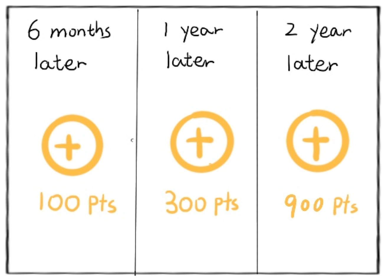
"6 month is too long, I would be bored." - Participant #7
We realized the barrier entry for AR would limit/reduce the impact we wanted to have and we didn't want people to get new phones just to able to use our app.
"Habit tracking is powerful because it leverages multiple laws of behavior change. It simultaneously makes a behavior obvious, attractive, and satisfying." - Atomic Habit
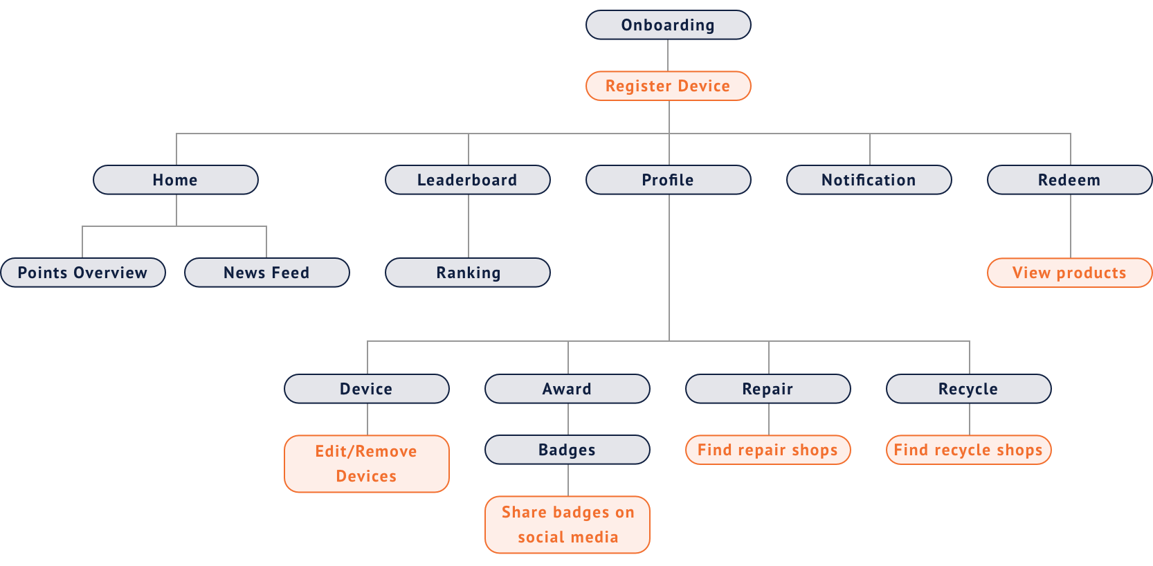
I created an Information Architecture to help the team and users to navigate to the information they need in the easiest way possible.
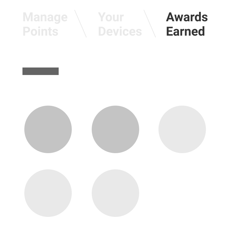
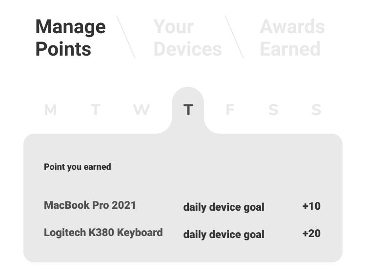
I led the UX and UI design of Ellipse to make sure our design is user-centered and would keep users engaged and motivated to extend the life of their electronics, which is our goal for this product.
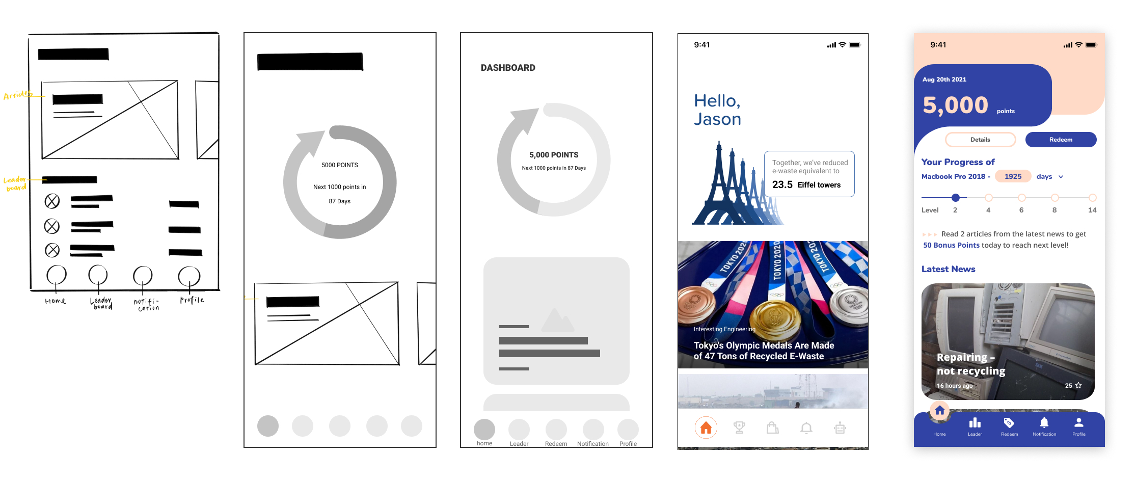
I led the wireframes from low-fidelity to high-fidelity for usability testing. We identified the hierarchy of the information and made sure the content ties back to all the findings we derived from our research and testing.
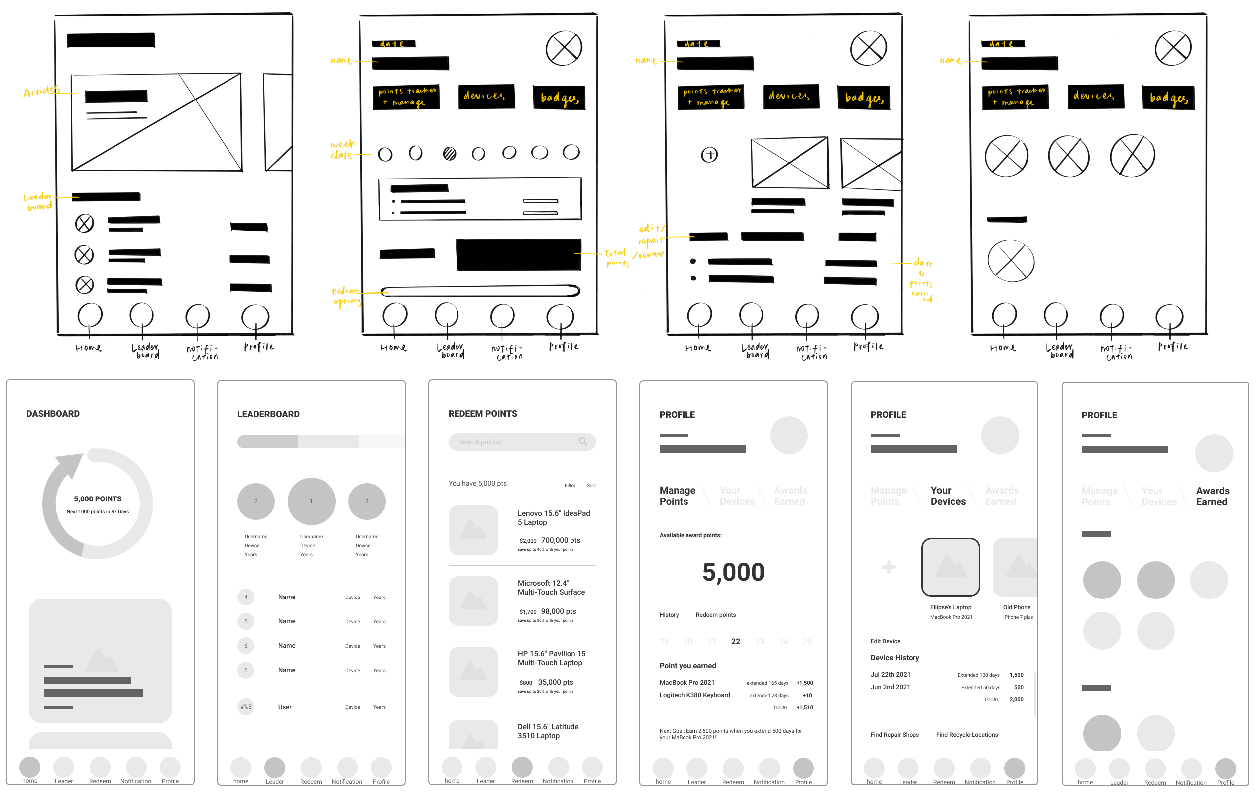

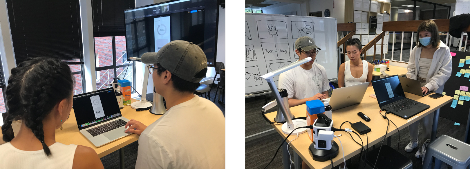
We conducted four usability testing with our high-fidelity wireframes. This helped us pinpoint unclear elements and refined our understanding of users’ perspectives.
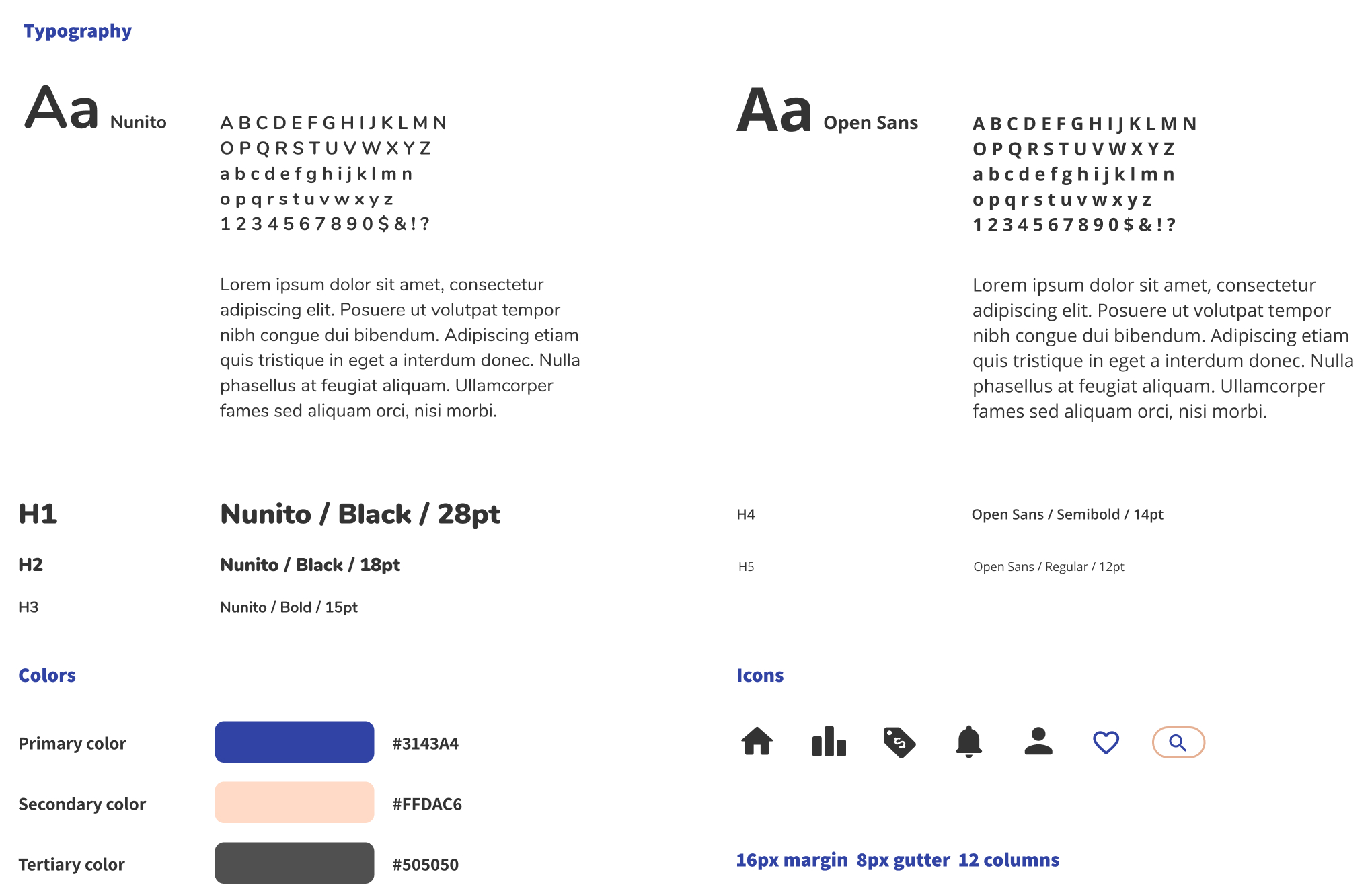
As we iterated and refined, I created our visual design system based on the color, font, and industry research I did.
We moved from low-fidelity prototypes into high-fidelity interactive prototypes as we tested, getting closer and closer to our final design.
Even though the goal of Ellipse is to try to change the purchasing behavior to curb the global e-waste problem, people are still the most important factor. It is crucial to constantly put ourselves in users' shoes to remind ourselves of the needs and wants of users. By understanding their desires and goals, we can provide a more user-centered design.
Why do we need AR? Does it have to be AR to achieve our goals? That was the question we kept asking ourselves for months. Even though the team really wanted to design an AR app, we realized that is not fully aligned with our design principles and user needs. It was a great learning experience to put what we wanted to do aside and focus on what is the best for the product and people.
Design is not only about design. I was really glad that besides all the research readings we did for the project, I was also reading other books outside of the project. The book Atomic Habits I read in my spare time turned out to help our project a lot since we were using behavioral change as our main strategy for Ellipse. It is important to be open and curious and not limit ourselves in the box so we can explore more possibilities and use our creativity fully.